项目起步
项目介绍
项目概述
该项目是基于 HarmonyOS NEXT 开发的鸿蒙应用,主要包含鸿蒙和前端的企业面试题以及真实的面试经验,还有一些面试辅助类的工具如常用开发单词和面试录音。
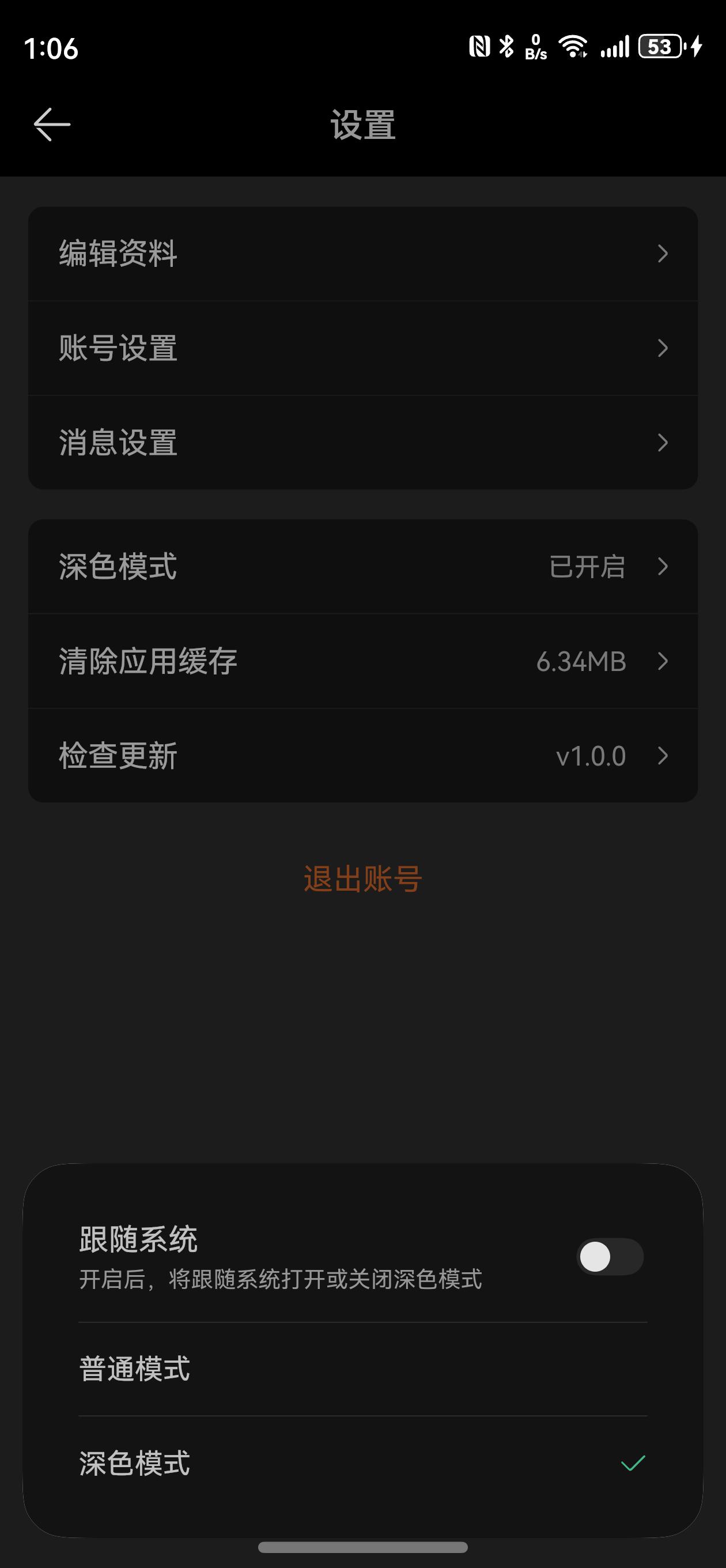
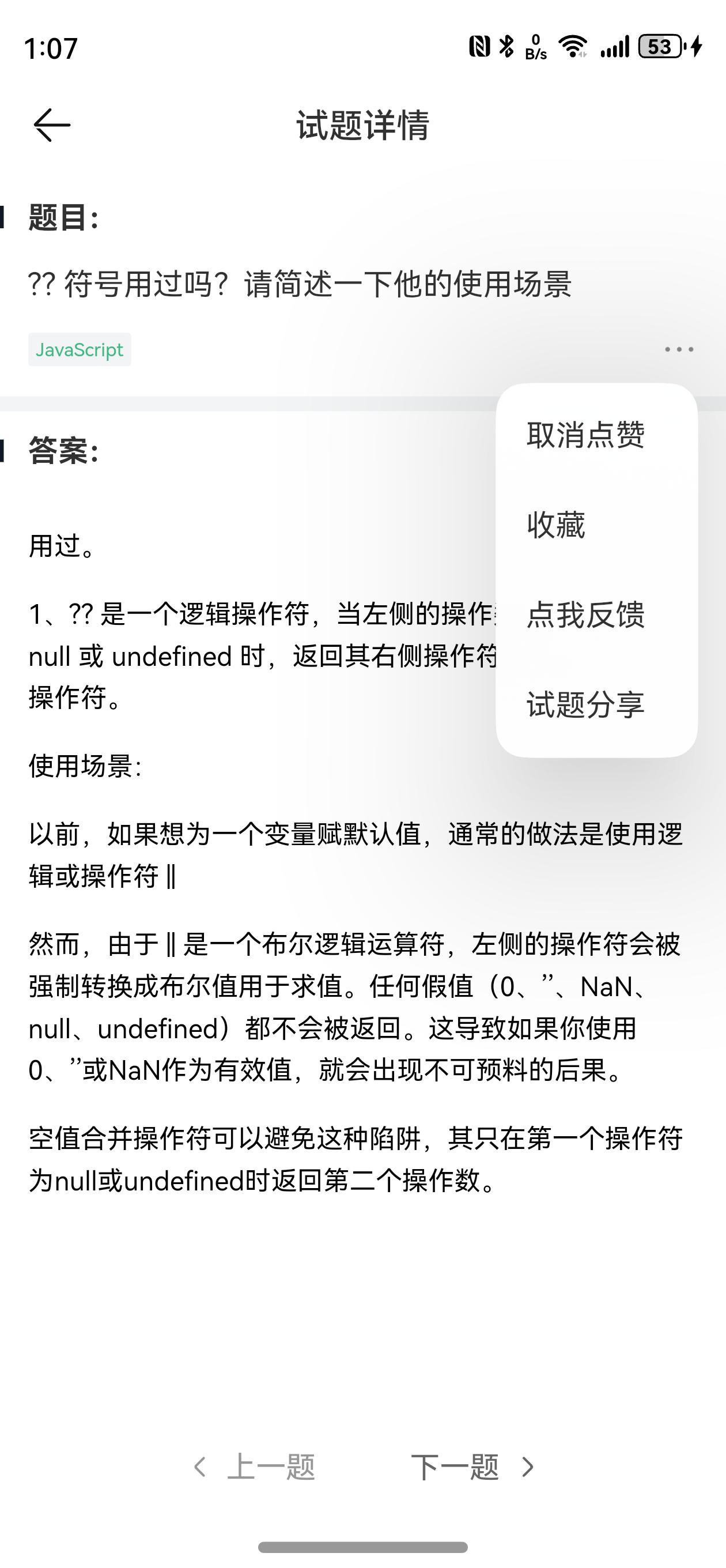
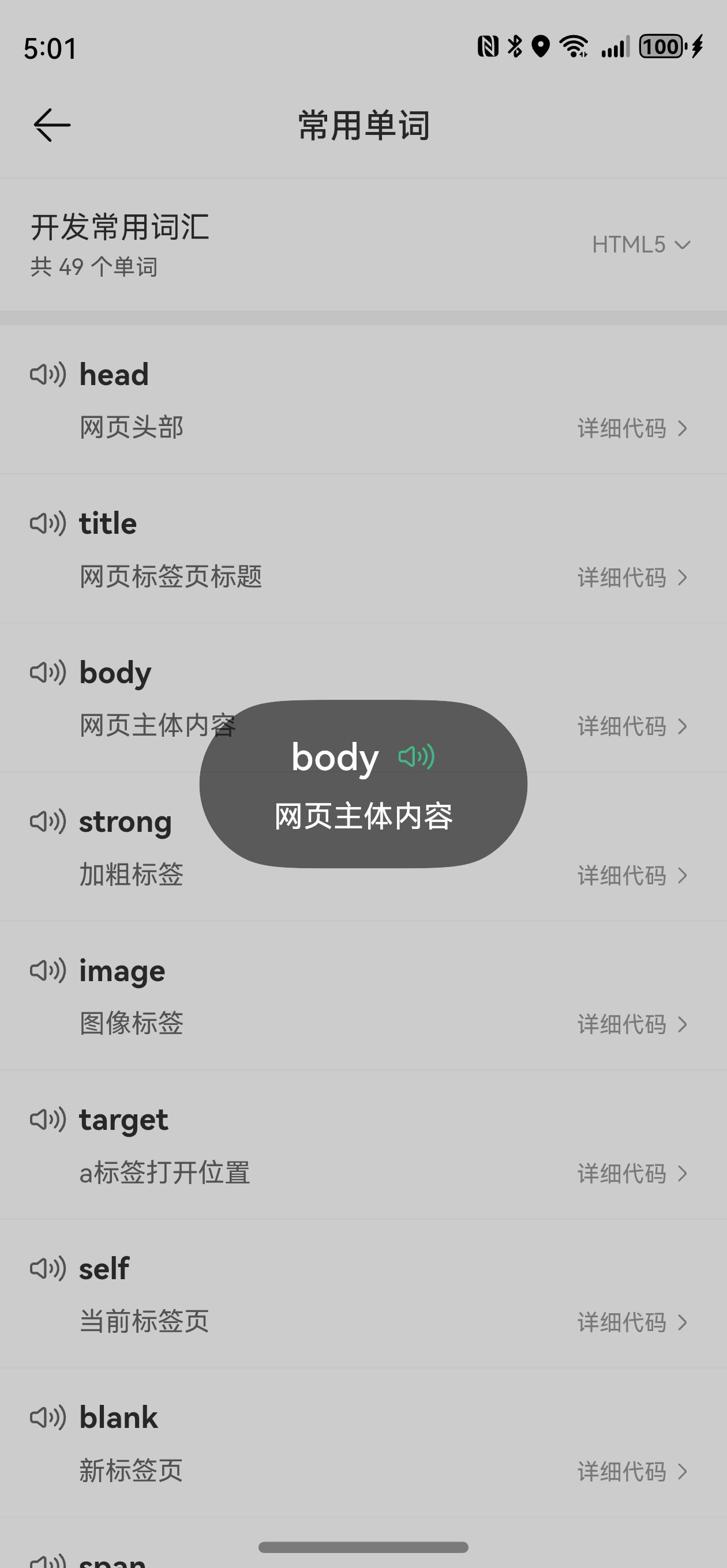
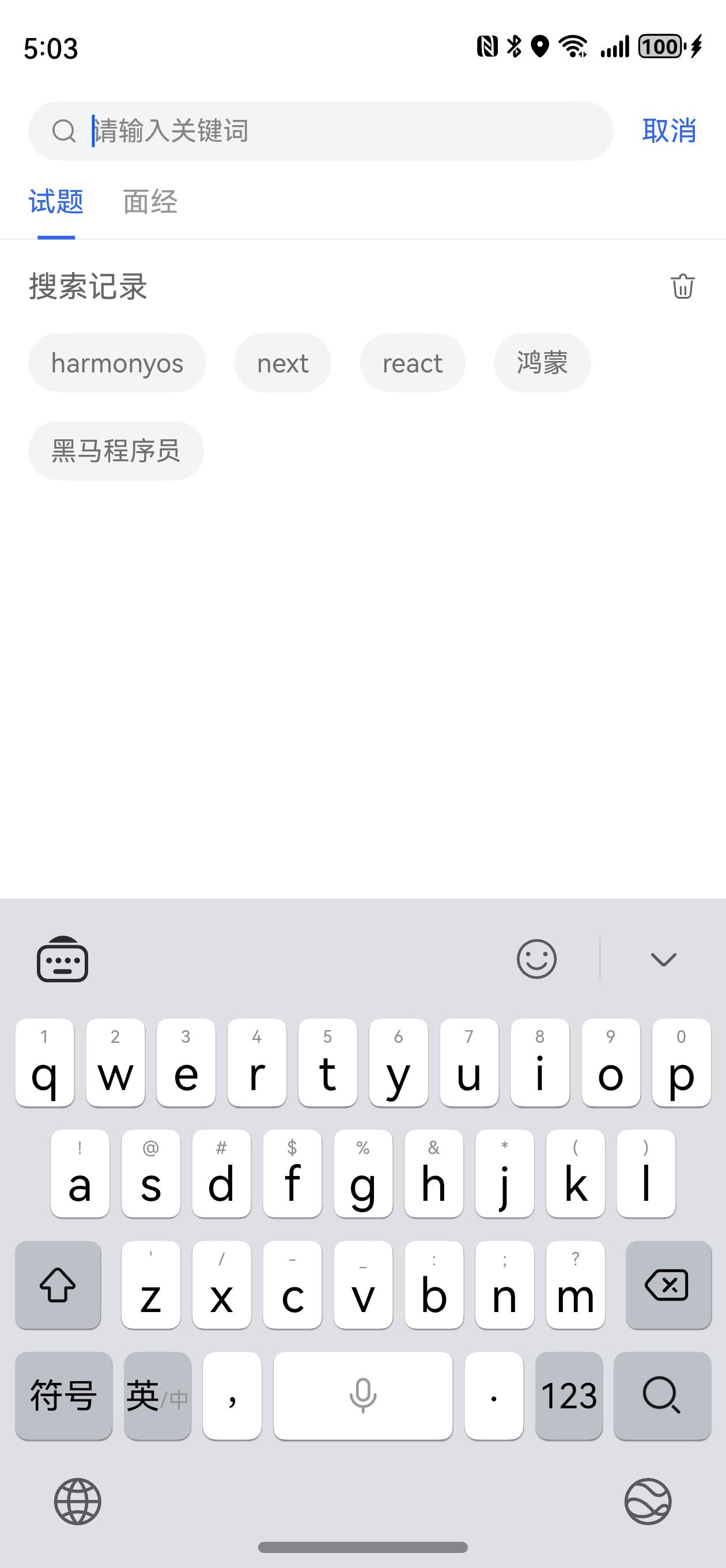
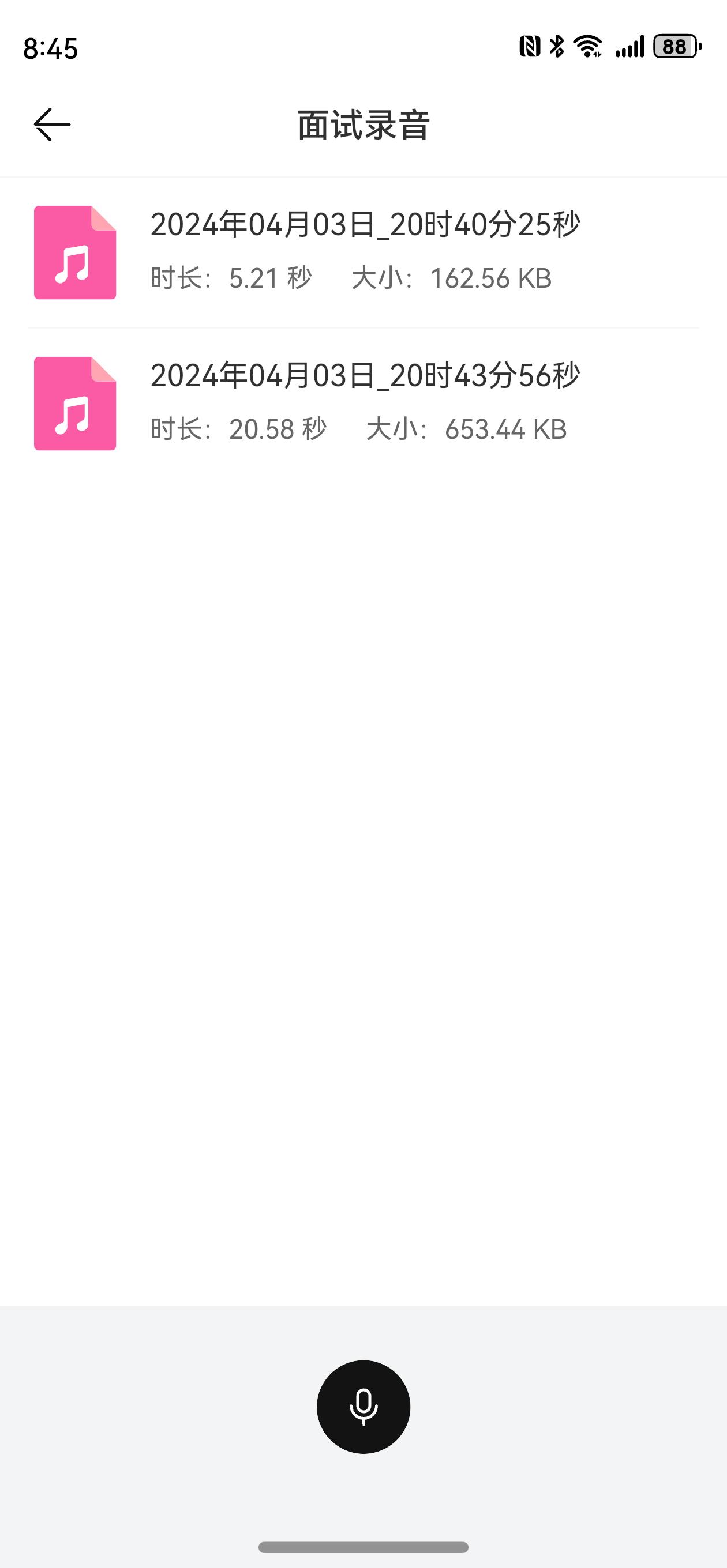
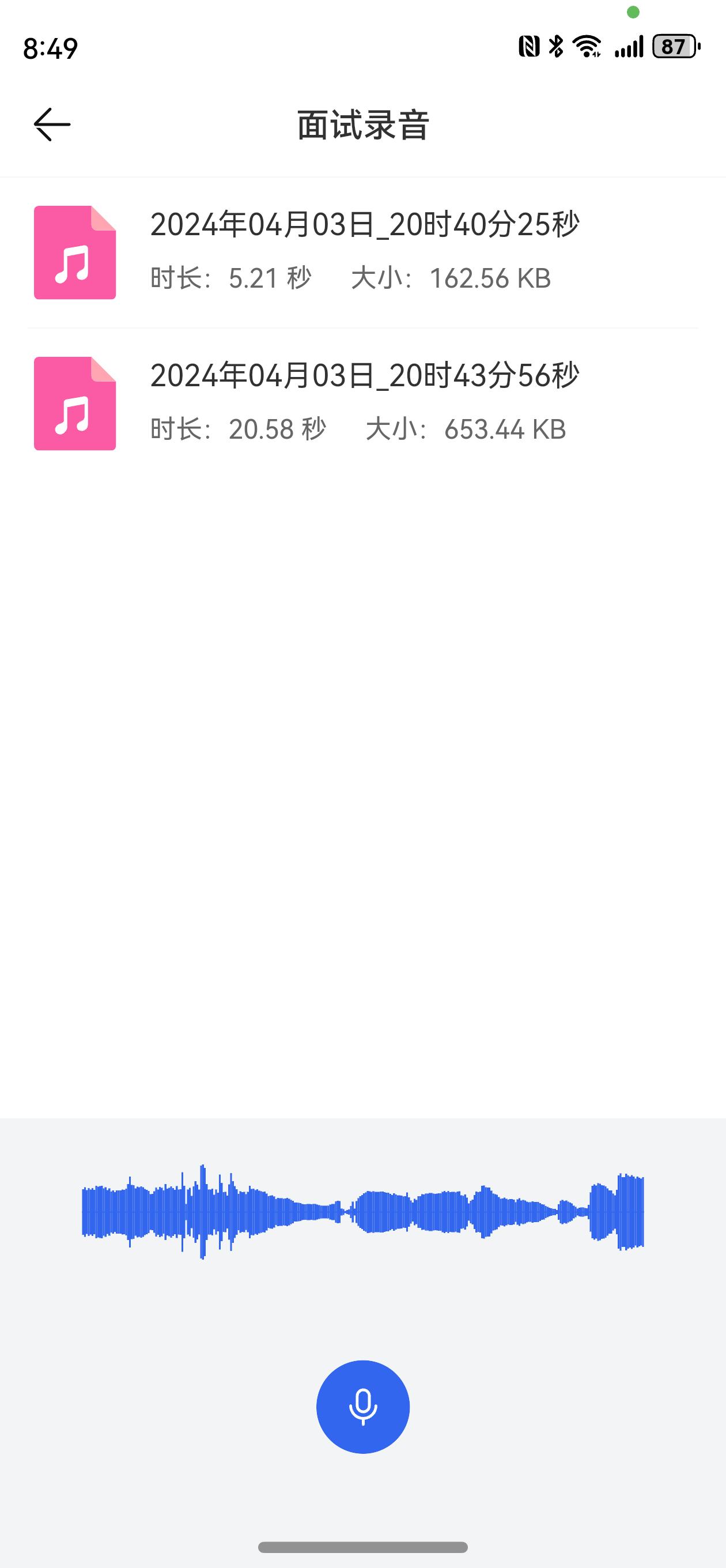
项目截图


开发资源
项目准备
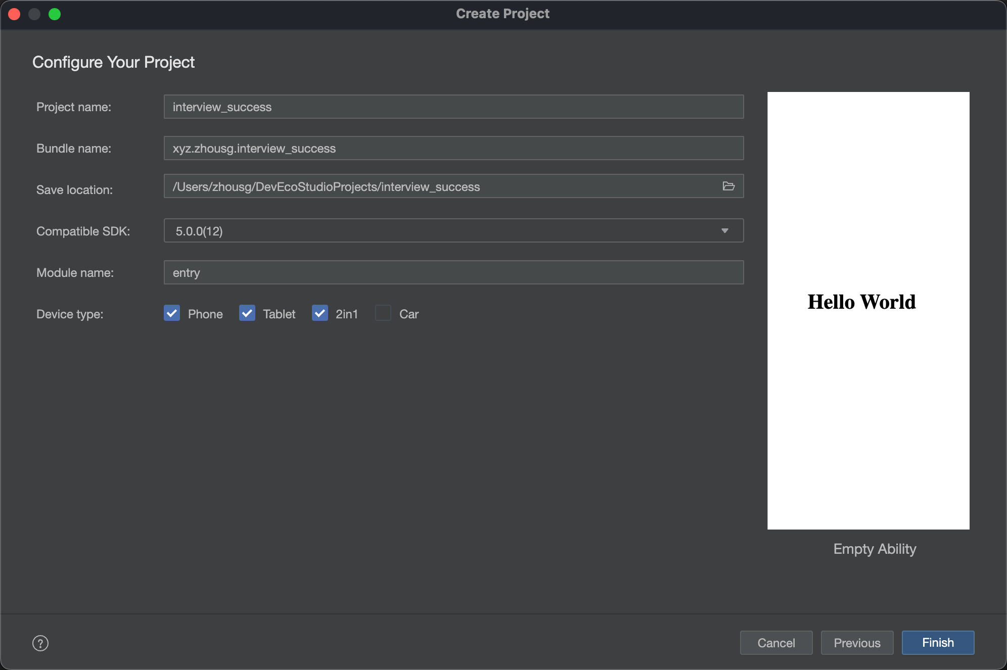
创建项目
目标:创建好项目,规划好项目的目录结构
→ 创建项目:
→ 项目采用单层架构模式:
ets
├── commons
│   ├── components              // - 通用组件
│   ├── constants               // - 全局常量数据
│   └── utils                   // - 通用工具类
├── entryability
│   └── EntryAbility.ts
├── models                      // - 数据模型
├── pages
│   ├── QuestionPage.ets        // - 页面组件
│   └── Index.ets
└── views
    └── Question                // - 页面对应自定义组件
资源配置
目标:准备颜色资源、需要的图片资源、修改应用名称和图标
1)颜色资源 resources/base/element/color.json
{
  "color": [
    {
      "name": "common_gray_01",
      "value": "#979797"
    },
    {
      "name": "common_gray_02",
      "value": "#848484"
    },
    {
      "name": "common_gray_03",
      "value": "#666666"
    },
    {
      "name": "common_gray_bg",
      "value": "#f3f4f5"
    },
    {
      "name": "common_gray_border",
      "value": "#e8e7ee"
    },
    {
      "name": "common_main_color",
      "value": "#FA6D1D"
    },
    {
      "name": "common_green",
      "value": "#41B883"
    },
    {
      "name": "common_blue",
      "value": "#3266EE"
    },
    {
      "name": "common_blue_bg",
      "value": "#EDF2FF"
    },
    {
      "name": "black",
      "value": "#131313"
    },
    {
      "name": "white",
      "value": "#ffffff"
    },
    {
      "name": "home_gray",
      "value": "#EDECF2"
    }
  ]
}
2)图片资源 resources/base/media
下载 media.zip 解压到项目 media 目录
3)配置应用图标和应用名称
- 桌面图标和名称
module.json5
   "abilities": [
      {
        "name": "EntryAbility",
        "srcEntry": "./ets/entryability/EntryAbility.ets",
        "description": "$string:EntryAbility_desc",
+        "icon": "$media:startIcon",
        "label": "$string:EntryAbility_label",
        "startWindowIcon": "$media:startIcon",
        "startWindowBackground": "$color:start_window_background",
        "exported": true,
        "skills": [
          {
            "entities": [
              "entity.system.home"
            ],
            "actions": [
              "action.system.home"
            ]
          }
        ]
      }
    ],
resources/zh_CN/element/string.json
{
  "name": "EntryAbility_label",
  "value": "面试通"
}- 设置应用与元服务的图标和名称
AppScope/resources/base/element/string.json
{
  "string": [
    {
      "name": "app_name",
      "value": "面试通"
    }
  ]
}
AppScope/resources/base/media/app_icon.png 替换 logo
Git 管理
目标:通过 Git 来管理项目开发产生的记录
- 使用 DevEco 初始化本地仓库并提交
- 使用 Gitee | Github 创建远程仓库
- 使用 DevEco 推送到远程仓库
温馨提示
后续每一个小节,或者每一个功能,提交一次代码,大家可以在 Gitee | Github 查看每一次提交的代码
通用工具
通用工具是支撑后续开发的基础,目前我们先实现 logger fullScreen statusBar 三个工具,后续随着开发的深入再实现 auth http 等工具。
日志工具
目标:知道
hilog如何使用,可以封装一个当前项目的日志工具
1. hilog 基本使用
HiLog 中定义了 DEBUG、INFO、WARN、ERROR、FATAL 五种日志级别
function debug(domain: number, tag: string, format: string, ...args: any[]): void;
function info(domain: number, tag: string, format: string, ...args: any[]): void;
function warn(domain: number, tag: string, format: string, ...args: any[]): void;
function error(domain: number, tag: string, format: string, ...args: any[]): void;
function fatal(domain: number, tag: string, format: string, ...args: any[]): void;
function isLoggable(domain: number, tag: string, level: LogLevel): boolean;- 参数 domain:用于指定输出日志所对应的业务领域,取值范围为 0x0000~0xFFFF,开发者可以根据需要进行自定义。
- 参数 tag:用于指定日志标识,可以为任意字符串,建议标识调用所在的类或者业务行为。
- 参数 format:格式字符串,用于日志的格式化输出。
%{public}s字符串%{public}d数字 - 参数 args:可以为 0 个或多个参数,可以为 0 个或多个参数,是格式字符串中参数类型对应的参数列表。
示例:
Button("hilog.info测试").onClick(() => {
  hilog.info(0x0000, "mylog", "%{public}s, %{public}s", "info", "info1");
});

Button("hilog.debug测试").onClick(() => {
  // debug表示调试日志,将来上线之后不会被执行
  hilog.debug(0x0000, "mylog", "%{public}s, %{public}s", "debug", "debug1");
});

Button("hilog.warn测试").onClick(() => {
  // 警告日志
  hilog.warn(0x0000, "mylog", "%{public}s, %{public}s", "warn", "warn1");
});

Button("hilog.error测试").onClick(() => {
  // 错误日志,当代码出错时调用
  hilog.error(0x0000, "mylog", "%{public}s, %{public}s", "error", "error1");
});
hilog和console区别?
console 基于 hilog 封装,默认的 domain/tag 是 A03D00/JSAPP
2. 封装 logger 工具
1)封装 commons/utils/Logger.ets
import { hilog } from '@kit.PerformanceAnalysisKit';

const LOGGER_PREFIX: string = 'interview_success_logger';

class Logger {
  private domain: number;
  private prefix: string;
  private format: string = '%{public}s, %{public}s';

  constructor(prefix: string = '', domain: number = 0x0000) {
    this.prefix = prefix;
    this.domain = domain;
  }

  debug(...args: string[]): void {
    hilog.debug(this.domain, this.prefix, this.format, args);
  }

  info(...args: string[]): void {
    hilog.info(this.domain, this.prefix, this.format, args);
  }

  warn(...args: string[]): void {
    hilog.warn(this.domain, this.prefix, this.format, args);
  }

  error(...args: string[]): void {
    hilog.error(this.domain, this.prefix, this.format, args);
  }
}

export const logger =  new Logger(LOGGER_PREFIX, 0x1234);
2)导出 commons/utils/index.ets
export * from './Logger'3)使用
import { logger } from '../commons/utils';
logger.info('IndexPage', '这是首页的日志')
然后替换项目默认的 hilog.xxx() 代码
沉浸式工具
目标:实现一个开启和关闭沉浸式的工具
前置知识:
- window.getLastWindow 获取当前窗口对象
- getWindowAvoidArea 使用窗口对象获取某一个区域的尺寸
将来很多地方需使用 context ,所以共享 context 对象
  onCreate(want: Want, launchParam: AbilityConstant.LaunchParam): void {
    logger.info( 'Ability onCreate');
+    AppStorage.setOrCreate('context', this.context)
  }
1)封装 commons/utils/FullScreen.ets
import { window } from '@kit.ArkUI';
import { logger } from './logger';

class FullScreen {
  async enable() {
    try {
      const context = AppStorage.get<Context>('context')
      if (context) {
        const win = await window.getLastWindow(context)
        await win.setWindowLayoutFullScreen(true)
        const topArea = win.getWindowAvoidArea(window.AvoidAreaType.TYPE_SYSTEM)
        AppStorage.setOrCreate('topHeight', px2vp(topArea.topRect.height))
        const bottomArea =  win.getWindowAvoidArea(window.AvoidAreaType.TYPE_NAVIGATION_INDICATOR)
        AppStorage.setOrCreate('bottomHeight', px2vp(bottomArea.bottomRect.height))
      }
    } catch (e) {
      logger.error('FullScreen enable', JSON.stringify(e))
    }
  }

  async disable() {
    try {
      const context = AppStorage.get<Context>('context')
      if (context) {
        const win = await window.getLastWindow(context)
        await win.setWindowLayoutFullScreen(false)
        AppStorage.setOrCreate('topHeight', 0)
        AppStorage.setOrCreate('bottomHeight', 0)
      }
    } catch (e) {
      logger.error('FullScreen disable', JSON.stringify(e))
    }
  }
}

export const fullScreen = new FullScreen()
2)导出 commons/utils/index.ets
export * from './FullScreen'3)使用和测试
在 EntryAbility.ets 使用
    logger.info( 'Ability onWindowStageCreate');
+    fullScreen.enable()
    windowStage.loadContent('pages/Index', (err) => {
在 pages/Index.ets 测试
@Entry
@Component
struct Index {
  @StorageProp('topHeight') topHeight: number = 0
  @StorageProp('bottomHeight') bottomHeight: number = 0

  build() {
    Column() {
      Text('top')
      Blank()
      Text('bottom')
    }
    .width('100%')
    .height('100%')
    .backgroundColor('red')
    .padding({ top: this.topHeight, bottom: this.bottomHeight })
  }
}
状态栏工具
目标:实现一个控制状态栏的工具,可以快捷设置黑色和白色状态文字
前置知识:
- setWindowSystemBarProperties 设置状态颜色
1)封装 commons/utils/StatusBar.est
import { window } from '@kit.ArkUI'
import { logger } from './Logger'

class StatusBar {
  async setDarkBar() {
    await this.setBar({ statusBarContentColor: '#000000' })
  }

  async setLightBar() {
    await this.setBar({ statusBarContentColor: '#FFFFFF' })
  }

  async setBar(config: window.SystemBarProperties) {
    try {
      const context = AppStorage.get<Context>('context')
      if (context) {
        const win = await window.getLastWindow(context)
        await win.setWindowSystemBarProperties(config)
      }
    } catch (e) {
      logger.error('StatusBar setBar', JSON.stringify(e))
    }
  }
}

export const statusBar = new StatusBar()
2)导出 commons/utils/index.ets
export * from './StatusBar'3)使用和测试
在 pages/Index.ets
      Row() {
        Button('Light')
          .onClick(() => {
            statusBar.setLightBar()
          })
        Button('Dark')
          .onClick(() => {
            statusBar.setDarkBar()
          })
      }