首页模块

页面结构
底部 Tab 切换
目标:实现底部 Tab 切换 首页 项目 面经 我的 页面结构
实现步骤:
- Tab 选项需要遍历,提前最备好数据
- 布局 Tabs 组件
- 准备对应页面,实现点击切换,关闭滑动切换
- 底部安全区处理
落地代码:
1)Tab 选项需要遍历,提前最备好数据
interface TabItem {
  icon: Resource;
  activeIcon: Resource;
  name: string;
} // struct Index 数据
tabList: TabItem[] = [
{
icon: $r('app.media.tabbar_home'),
activeIcon: $r('app.media.tabbar_home_fill'),
name: '首页'
},
{
icon: $r('app.media.tabbar_project'),
activeIcon: $r('app.media.tabbar_project_fill'),
name: '项目'
},
{
icon: $r('app.media.tabbar_interview'),
activeIcon: $r('app.media.tabbar_interview_fill'),
name: '面经'
},
{
icon: $r('app.media.tabbar_mine'),
activeIcon: $r('app.media.tabbar_mine_fill'),
name: '我的'
}
]2)布局 Tabs 组件
  @Builder
  TabBarBuilder(item: TabItem, index: number) {
    Column({ space: 5 }) {
      Image(this.activeIndex === index ? item.activeIcon : item.icon)
        .width(24)
        .aspectRatio(1)
      Text(item.name)
        .fontSize(12)
        .fontColor(this.activeIndex === index ? $r('app.color.black') : $r('app.color.common_gray_01'))
    }
  }

  build() {
    Column() {
      Tabs({ index: this.activeIndex }) {
        ForEach(this.tabList, (item: TabItem, i) => {
          TabContent() {
            // TODO 页面组件
          }
          .tabBar(this.TabBarBuilder(item, i))
        })
      }
      .divider({ strokeWidth: 0.5, color: $r('app.color.common_gray_border') })
      .barPosition(BarPosition.End)
    }
    .width('100%')
    .height('100%')
    .backgroundColor($r('app.color.white'))
  }
3)准备对应页面,实现点击切换,关闭滑动切换
pages/HomePage.ets
@Component
export struct HomePage {
  build() {
    Text('Home')
  }
}
pages/ProjectPage.ets
@Component
export struct ProjectPage {
  build() {
    Text('Home')
  }
}
pages/InterviewPage.ets
@Component
export struct InterviewPage {
  build() {
    Text('Home')
  }
}
pages/MinePage.ets
@Component
export struct MinePage {
  build() {
    Text('Home')
  }
}
pages/Index.ets 实现点击切换,关闭滑动切换
     Tabs({ index: this.activeIndex }) {
        ForEach(this.tabList, (item: TabItem, i) => {
          TabContent() {
            if (i === 0) {
              HomePage()
            } else if (i === 1) {
              ProjectPage()
            } else if (i === 2) {
              InterviewPage()
            } else {
              MinePage()
            }
          }
          .tabBar(this.TabBarBuilder(item, i))
        })
      }
      .divider({ strokeWidth: 0.5, color: $r('app.color.common_gray_border') })
      .barPosition(BarPosition.End)
      .scrollable(false)
      .onTabBarClick(i => {
        this.activeIndex = i
      })
4)底部安全区处理
// 获取安全区高度
@StorageProp('bottomHeight') bottomHeight: number = 0 // 根据它设置间距
.onTabBarClick(i => {
this.activeIndex = i
})
.margin({ bottom: this.bottomHeight })HcSearchBox 组件
目标:封装一个可以设置文字、背景、文字颜色、尺寸的搜索占位组件应用内复用
实现步骤:
- 准备首页容器
- 封装搜索占位组件
- 使用组件
落地代码:
1)准备首页容器 pages/HomePage.ets
@Component
export struct HomePage {
  @StorageProp('topHeight') topHeight: number = 0

  build() {
    Column() {
      Row({ space: 16 }) {
        Image($r('app.media.ic_home_scan'))
          .width(24)
          .aspectRatio(1)
        Blank()
        // TODO 搜索组件
      }
      .padding({ left: 16, right: 16 })
      .height(64)
      .width('100%')
    }
    .padding({ top: this.topHeight })
    .width('100%')
    .height('100%')
    .backgroundColor($r('app.color.common_gray_bg'))
  }
}
2)封装搜索占位组件
commons/components/HcSearchBox.ets
@Component
export struct HcSearchBox {
   @Prop boxWidth: Length = 100
   @Prop boxHeight: number = 32
   @Prop ph: ResourceStr = '搜索题目'
   @Prop phColor: ResourceColor = $r('app.color.common_gray_02')
   @Prop bgColor: ResourceColor = $r('app.color.common_gray_border')
   @Prop layoutWeightValue: number = 0

  build() {
    Row({ space: 4 }){
      Image($r('app.media.ic_common_search'))
        .width(14)
        .aspectRatio(1)
        .fillColor(this.phColor)
      Text(this.ph)
        .fontSize(14)
        .fontColor(this.phColor)
    }
    .width(this.boxWidth)
    .height(this.boxHeight)
    .backgroundColor(this.bgColor)
    .borderRadius(this.boxHeight / 2)
    .justifyContent(FlexAlign.Center)
    .layoutWeight(this.layoutWeightValue)
  }
}
commons/components/index.ets
export * from "./HcSearchBox";3)使用组件 pages/HomePage.ets
      Row({ space: 16 }) {
        Image($r('app.media.ic_home_scan'))
          .width(24)
          .aspectRatio(1)
+        HcSearchBox({ layoutWeightValue: 1})
      }
HcClockIn 组件
目标:封装一个未打卡、已打卡显示两种状态的组件应用内复用
实现步骤:
- 封装,定义一个打卡次数,来判断显示状态
- 首页使用
落地代码:
1)封装
commons/components/HcClockIn.ets
@Preview
@Component
export struct HcClockIn {
  // 大于表示已打卡
  @Prop clockInCount: number = 0

  build() {
    Row(){
      if (this.clockInCount > 0) {
        Column(){
          Text('已连续打卡')
            .fontColor($r('app.color.black'))
            .fontSize(8)
          Text(){
            Span(this.clockInCount.toString())
              .fontSize(12)
              .fontWeight(600)
            Span('天')
              .fontSize(10)
          }
          .fontColor($r('app.color.black'))
        }
        .margin({ left: 30})
      } else {
        Text('打卡')
          .fontColor($r('app.color.black'))
          .fontSize(18)
          .fontWeight(500)
          .margin({ left: 30, top: -4 })
      }
    }
    .width(74)
    .height(28)
    .backgroundImage($r('app.media.ic_common_clocked'))
    .backgroundImageSize(ImageSize.Contain)
  }
}
commons/components/index.ets
export * from "./HcClockIn";2)使用 pages/HomePage.ets
      Row({ space: 16 }) {
        Image($r('app.media.ic_home_scan'))
          .width(24)
          .aspectRatio(1)
        HcSearchBox({ layoutWeightValue: 1})
+        HcClockIn()
      }
轮播图 Builder
目标:抽取轮播图 Item Builder 实现轮播图效果
实现步骤:
- 分析布局和适配需求,实现 SwiperItemBuilder
- 实现轮播图效果,调整指示器
落地代码:pages/HomePage.ets
1)封装 SwiperItemBuilder
  @Builder
  SwiperItemBuilder(src: ResourceStr) {
    Row() {
      Image(src)
        .width('100%')
        .aspectRatio(2.65)
        .objectFit(ImageFit.Fill)
    }
    .width('100%')
    .padding({ left: 16, right: 16 })
  }
2)实现轮播图
      Swiper() {
        ForEach([$r('app.media.banner_ai'), $r('app.media.banner_pj'), $r('app.media.banner_qa')],
          (item: ResourceStr) => {
            this.SwiperItemBuilder(item)
          })
      }
      .margin({ bottom: 16 })
      .autoPlay(true)
      .indicator(DotIndicator.dot()
        .bottom(4)
        .itemHeight(4)
        .selectedItemHeight(4)
        .selectedColor($r('app.color.white')))
试题分类组件
目标:根据模拟数据绘制试题分类组件,实现切换分类效果
实现步骤:
- views 下新建组件,Home 准备一个容器来使用组件
- 根据模拟数据绘制组件基本结构
- 实现自定义 TabBar,实现切换分类效果
落地代码:
1)views 下新建组件,Home 准备一个容器来使用组件 views/Home/HomeCategory.ets
@Component
export struct HomeCategory {
  build () {

  }
}
pages/HomePage.ets
      // 试题Tabs
      Column(){
        HomeCategory()
      }
      .width('100%')
      .layoutWeight(1)
      .backgroundColor($r('app.color.white'))
2)根据模拟数据绘制组件基本结构 models/index.ets
export interface QuestionType {
  id: number
  name: string
  displayNewestFlag: 0 | 1
}
views/Home/HomeCategory.ets
import { QuestionType } from '../../models'

@Component
export struct HomeCategory {
  @State questionTypeList: QuestionType[] = mockData
  @State activeIndex: number = 0


  build() {
    Tabs({ index: this.activeIndex }) {
      ForEach(this.questionTypeList, (item: QuestionType, i) => {
        TabContent() {
          // TODO 试题列表
        }
        .tabBar(item.name)
      })
    }
    .onTabBarClick((i) => {
      this.activeIndex = i
    })
    .barMode(BarMode.Scrollable)
    .barHeight(44)
    .scrollable(false)
    .divider({ strokeWidth: 0.5, color: $r('app.color.common_gray_border') })
  }
}

const mockData: QuestionType[] = [
  { id: 1, name: 'ArkTS', displayNewestFlag: 0 },
  { id: 2, name: 'ArkUI', displayNewestFlag: 1 },
  { id: 3, name: 'Hap', displayNewestFlag: 1 },
  { id: 4, name: 'Hsp', displayNewestFlag: 0 },
  { id: 5, name: 'Har', displayNewestFlag: 0 },
  { id: 6, name: 'Ability', displayNewestFlag: 0 },
  { id: 7, name: 'Stage', displayNewestFlag: 0 },
  { id: 8, name: 'Kit', displayNewestFlag: 0 }
]
3)实现自定义 TabBar,实现切换分类效果 views/Home/HomeCategory.ets
@Builder
  TabBarBuilder(item: QuestionType, i: number) {
    Row() {
      Stack({ alignContent: Alignment.Bottom }){
        Text(item.name)
          .fontSize(15)
          .fontColor(this.activeIndex === i ? $r('app.color.black') : $r('app.color.common_gray_01'))
          .height(44)
        Text()
          .width(this.activeIndex === i ? 20 : 0)
          .height(2)
          .backgroundColor($r('app.color.black'))
          .animation({ duration: this.activeIndex === i ? 300 : 0 })
      }
      if (item.displayNewestFlag === 1) {
        Image($r('app.media.ic_home_new'))
          .width(32)
          .height(14)
          .objectFit(ImageFit.Contain)
          .margin({ left: 4 })
      }
    }
    .padding({ left: 16, right: right: this.questionTypeList.length === i + 1 ? 16 : 0 })
} TabContent() {
// TODO 试题列表
}
+ .tabBar(this.TabBarBuilder(item, i))HcTag 组件
目标:封装一个通用的标签组件,支持线上题目难度,支持自定义文字和颜色
实现步骤:
- 分析题目难度 1-5 如何对应三种 tag 样式,定义好数据
- 实现 tag 组件,支持自定义文字和颜色优先
落地代码:
1)分析题目难度 1-5 如何对应三种 tag 样式,定义好数据 commons/components/HcTag.ets
1-2 是简单,3-4 是一般,5 是困难,可以使用 Record 定义好数据,根据 1-5 来取
interface HcTagInfo {
  text: string;
  color: ResourceColor;
}

const infoMap: Record<number, HcTagInfo> = {
  1: { text: "简单", color: $r("app.color.common_green") },
  2: { text: "简单", color: $r("app.color.common_green") },
  3: { text: "一般", color: $r("app.color.common_blue") },
  4: { text: "一般", color: $r("app.color.common_blue") },
  5: { text: "困难", color: $r("app.color.common_main_color") },
};
2)实现 tag 组件,支持自定义文字和颜色优先 commons/components/HcTag.ets
/**
 * HcTag 组件
 * 1. 支持 difficulty 显示3中颜色标签,1-2是简单,3-4是一般,5是困难
 * 2. 如果 text 或者 bg 传入,则优先使用
 */
@Component
export struct HcTag {
  @Prop difficulty: number = 1
  @Prop text: string = ''
  @Prop color: ResourceColor = ''

  build() {
    Text(this.text || infoMap[this.difficulty].text)
      .fontColor(this.color || infoMap[this.difficulty].color)
      .fontSize(10)
      .padding({ left: 6, right: 6 })
      .height(18)
      .constraintSize({ minWidth: 34 })
      .borderRadius(2)
      .backgroundColor($r('app.color.common_gray_bg'))
      .textAlign(TextAlign.Center)
  }
}
3)测试
          Column({ space: 5 }){
            HcTag({ difficulty: 1 })
            HcTag({ difficulty: 2 })
            HcTag({ difficulty: 3 })
            HcTag({ difficulty: 4 })
            HcTag({ difficulty: 5 })
            HcTag({ text: 'HarmonyOS', color: '#FF0000' })
          }
试题 Item Comp
目标:封装试题 Item 组件,暴露 item 渲染不同内容
实现步骤:
- 编写静态组件,使用
RowSplit+@Extend组件展示点赞浏览等数据 - 定义试题数据类型,暴露 item 渲染不同内容
落地代码:
1)编写静态组件 commons/components/QuestionItemComp.ets
import { HcTag } from './HcTag'

@Preview
@Component
export struct QuestionItemComp {

  build() {
    Column({ space: 10 }) {
      Row({ space: 5 }) {
        HcTag()
        Text('ArkUI的容器组件有哪些?')
          .fontSize(15)
          .layoutWeight(1)
          .maxLines(1)
          .textOverflow({ overflow: TextOverflow.Ellipsis })
          .fontWeight(500)
      }
      .width('100%')

      RowSplit() {
        Text('点赞 100')
          .grayText(true)
        Text('浏览 1000')
          .grayText()
        Text('已看过')
          .grayText()
      }
    }
    .padding({ left: 16, right: 16 })
    .width('100%')
    .height(80)
    .alignItems(HorizontalAlign.Start)
    .justifyContent(FlexAlign.Center)
  }
}

@Extend(Text)
function grayText(isStart: boolean = false) {
  .lineHeight(13)
  .fontSize(13)
  .fontColor($r('app.color.common_gray_01'))
  .padding({ left: isStart ? 0 : 12, right: 12 })
}
2)定义试题数据类型,暴露 item 动态渲染
models/index.ets
export interface QuestionItem {
  id: string;
  /* 题干 */
  stem: string;
  /* 难度 */
  difficulty: number;
  /* 点赞数 */
  likeCount: number;
  /* 浏览数 */
  views: number;
  /* 是否已看 */
  readFlag: 0 | 1;
}
commons/components/QuestionItemComp.est
import { QuestionItem } from '../../models'
import { HcTag } from './HcTag'

@Preview
@Component
export struct QuestionItemComp {
  @Prop item: QuestionItem = {} as QuestionItem

  build() {
    Column({ space: 10 }) {
      Row({ space: 5 }) {
        HcTag({ difficulty: this.item.difficulty })
        Text(this.item.stem)
          .fontSize(15)
          .layoutWeight(1)
          .maxLines(1)
          .textOverflow({ overflow: TextOverflow.Ellipsis })
          .fontWeight(500)
      }
      .width('100%')

      RowSplit() {
        Text('点赞 ' + this.item.likeCount)
          .grayText(true)
        Text('浏览 ' + this.item.views)
          .grayText()
        if (this.item.readFlag === 1) {
          Text('已看过')
            .grayText()
        }
      }
    }
    .padding({ left: 16, right: 16 })
    .width('100%')
    .height(80)
    .alignItems(HorizontalAlign.Start)
    .justifyContent(FlexAlign.Center)
  }
}

@Extend(Text)
function grayText(isStart: boolean = false) {
  .lineHeight(13)
  .fontSize(13)
  .fontColor($r('app.color.common_gray_01'))
  .padding({ left: isStart ? 0 : 12, right: 12 })
}
3)测试
Column() {
  ForEach(new Array(10).fill(0), () => {
    QuestionItemComp({
      item: {
        id: '100',
        stem: '请说下ArkUI的容器组件有哪些?',
        difficulty: 3,
        likeCount: 23,
        views: 423,
        readFlag: 1
      }
    })
  })
}
试题 List Comp
目标:实现试题 List 组件,能够实现下拉刷新,上拉加载效果
实现步骤:
- 使用
RefreshList和QuestionItemComp组件搭建基础结构和样式 - 完成 下拉刷新 效果,不含数据刷新
- 完成 上拉加载
Builder - 完成 上拉加载 完整效果
- 完成 下拉刷新 完整效果
落地代码:commons/components/QuestionListComp.ets
1)使用 Refresh List 和 QuestionItemComp 组件搭建基础结构和样式
import { QuestionItemComp } from '.'
import { QuestionItem } from '../../models'

@Component
export struct QuestionListComp {
  @State list: QuestionItem[] = []

  build() {
    Refresh({ refreshing: $$this.isRefreshing }) {
      List() {
        ForEach(new Array(10).fill(0), () => {
          ListItem() {
            QuestionItemComp({
              item: {
                id: '100',
                stem: '请说下ArkUI的容器组件有哪些?',
                difficulty: 3,
                likeCount: 23,
                views: 423,
                readFlag: 1
              }
            })
          }
        })
      }
      .divider({
        strokeWidth: 0.5,
        color: $r('app.color.common_gray_border'),
        startMargin: 16,
        endMargin: 16
      })
      .width('100%')
      .height('100%')
      .scrollBar(BarState.Off)
      .edgeEffect(EdgeEffect.None)
    }
  }
}
2)通过 isRefreshing 控制刷新效果
// 控制刷新的状态
@State isRefreshing: boolean = false // 模拟1秒更新完成
onRefresh() {
setTimeout(() => {
this.isRefreshing = false
}, 1000)
} // Refresh 绑定事件
.onRefreshing(() => {
this.onRefresh()
})3)通过 isFinished isLoading 控制底部加载更多容器显示的内容
  // 是否加载完成
  @State isFinished: boolean = false
  // 正在加载中...
@State isLoading: boolean = false@Builder
LoadMoreBuilder() {
ListItem() {
// 加载完成
if (this.isFinished) {
Row() {
Text('没有更多了~')
.fontSize(14)
.fontColor($r('app.color.common_gray_03'))
}
.justifyContent(FlexAlign.Center)
.width('100%')
}
// 没有加载完成且正在加载中
else if (this.isLoading) {
Row({ space: 4 }) {
LoadingProgress()
.width(20)
Text('正在加载...')
.fontSize(14)
.fontColor($r('app.color.common_gray_03'))
}
.justifyContent(FlexAlign.Center)
.width('100%')
}
}
.height(80)
} List() {
ForEach(this.list, () => {
// ...
})
this.LoadMoreBuilder()
}4)通过 onReachEnd 实现上拉加载效果
  // 加载逻辑
  onLoad() {
    setTimeout(() => {
      for (let i = 0; i < 10; i++) {
        this.list.push({} as QuestionItem)
      }
      this.isLoading = false
      if (this.list.length >= 40) {
        this.isFinished = true
      }
    }, 1000)
} // List 组件
List() {
ForEach(this.list, () => {})
// ...
.onReachEnd(() => {
if (this.isLoading || this.isFinished || this.isRefreshing ) {
return
}
this.isLoading = true
this.onLoad()
})
}5)完善下拉刷新数据更新效果
  onRefresh() {
    setTimeout(() => {
      this.list = []
      for (let i = 0; i < 10; i++) {
        this.list.push({} as QuestionItem)
      }
      this.isRefreshing = false
      this.isFinished = false
    }, 1000)
  }
交互功能
http 请求工具
目标:封装一个请求工具,提供便捷的数据类型设置
module.json5 开启请求权限
    "requestPermissions": [
      { "name": "ohos.permission.INTERNET" }
    ],
实现步骤:
- 分析
axios代码的痛点,得到封装的目标 - 创建基础的 axios 实例,封装一个请求工具类
落地代码:commons/utils/Http.ets
1)分析痛点
    interface Res {
      message: string
      code: number
      data: QuestionType[]
    }
    instance<null, AxiosResponse<Res, null>, Object>({ url: 'question/type' }).then(res => {
      // 需要的数据
      logger.debug('ResData', JSON.stringify(res.data.data))
    }).catch((err: BusinessError) => {
      logger.error('ResData', JSON.stringify(err))
    })
痛点:泛型使用麻烦,使用响应结果麻烦
2)一个请求工具类
/**
 * Http 请求工具,基于 axios 封装
 */
import axios, { AxiosError, AxiosRequestConfig, AxiosResponse } from '@ohos/axios'
import { logger } from './Logger'

export const baseURL = 'https://api-harmony-teach.itheima.net/hm/'

export const instance = axios.create({
  baseURL,
  timeout: 100000
})

// 响应拦截器
instance.interceptors.response.use((res: AxiosResponse) => {
  if (res.data.code === 10000) {
    logger.debug('Req Success', JSON.stringify(res.data.data))
    return res.data.data
  }
  logger.error('Req Error', JSON.stringify(res.data))
  return Promise.reject(res.data)
}, (err: AxiosError) => {
  logger.error('Req Error', JSON.stringify(err))
  return Promise.reject(err)
})

class Http {
  // Get 请求可以省略第二个泛型,因为axios默认是any任何值可传
  request<ResponseData, RequestData = Object>(config: AxiosRequestConfig<RequestData>) {
    return instance<null, ResponseData, RequestData>(config)
  }
}

export const http = new Http()
3)使用 http 试题分类展示 views/Home/HomeCategory.ets
  aboutToAppear(): void {
    this.getQuestionTypeList()
  }

  async getQuestionTypeList () {
    const res = await http.request<QuestionType[]>({ url: 'question/type' })
    this.questionTypeList = res
  }
试题列表展示
目标:实现实例列表的上来加载、下拉刷新和渲染
实现步骤:
- 根据接口文档定义 数据类型 和 参数类型
- 定义获取试题列表的方法
- 实现上拉加载并渲染
- 实现下拉刷新
落地代码:
1)根据接口文档定义 数据类型 和 参数类型 model/index.ets
export interface PageData<T> {
  total: number
  pageTotal: number
  rows: T[]
}

export enum SortType {
  Default = 0,
  DifficultyLow = 10,
  DifficultyHigh = 11,
  ViewLow = 20,
  ViewHigh = 21,
  Commend = 30
}

export interface QuestionListParams {
  type: number
  questionBankType: 9 | 10
  sort?: SortType
  page?: number
  pageSize?: number
}
2)定义获取试题列表的方法
commons/views/HomeCategory.ets 传入typeId查询参数
      ForEach(this.questionTypeList, (item: QuestionType, i) => {
        TabContent() {
          QuestionListComp({typeId: item.id })
        }
        .tabBar(this.TabBarBuilder(item, i))
      })
commons/components/QuestionListComp.ets 接受参数,定义获取数据方法
  // 试题ID
  @Prop typeId: number
  @Prop sort: SortType = SortType.Default
@State page: number = 1 getQuestionList(): Promise<PageData<QuestionItem>> {
return http.request<PageData<QuestionItem>>({
url: 'question/list',
params: {
type: this.typeId,
questionBankType: 10,
sort: this.sort,
page: this.page,
pageSize: 10
} as QuestionListParams
})
}3)实现上拉加载并渲染 commons/components/QuestionListComp.ets
  async onLoad() {
    const res = await this.getQuestionList()
    this.list.push(...res.rows)
    this.isLoading = false
    if (this.page >= res.pageTotal) {
      this.isFinished = true
    } else {
      this.page++
    }
} ForEach(this.list, (item: QuestionItem) => {
ListItem() {
QuestionItemComp({
item: item
})
}
})4)实现下拉刷新 commons/components/QuestionListComp.ets
async onRefresh() {
this.page = 1
const res = await this.getQuestionList()
this.list = res.rows
this.isRefreshing = false
if (this.page >= res.pageTotal) {
this.isFinished = true
} else {
this.isFinished = false
this.page++
}
promptAction.showToast({ message: '更新成功' })
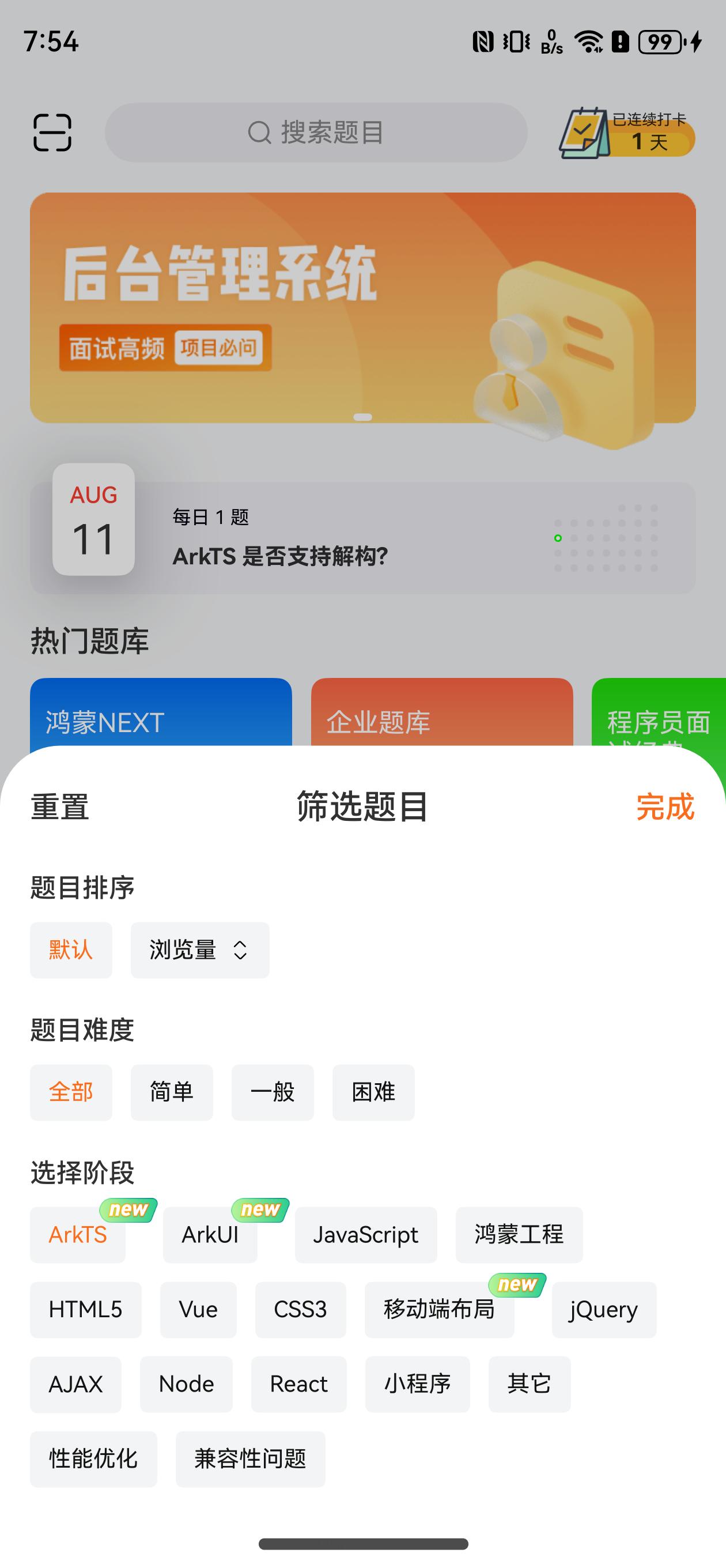
}筛选半模态
目标:实现筛选半模态框布局
实现步骤:
- 准备模块Builder包含基本静态结构和控制模态框的数据
- 封装一个筛选按钮组件,支持排序和新图片
落地代码:views/Home/HomeCategory.ets
1)准备模块Builder包含基本静态结构和控制模态框的数据
@State isShow: boolean = false @Builder
FilterSheetBuilder() {
Column() {
Row() {
Text('重置')
.fontSize(16)
.fontWeight(500)
.fontColor($r('app.color.common_gray_03'))
Text('筛选题目')
.layoutWeight(1)
.fontSize(18)
.fontWeight(500)
.fontColor($r('app.color.black'))
.textAlign(TextAlign.Center)
Text('完成')
.fontWeight(500)
.fontSize(16)
.fontColor($r('app.color.common_main_color'))
}
.margin({ bottom: 4, top: 4 })
Text('题目排序')
.textTitle()
// TODO 筛选按钮
Text('选择分类')
.textTitle()
// TODO 筛选按钮
}
.padding(16)
.backgroundColor($r('app.color.white'))
.height('100%')
}@Extend(Text)
function textTitle() {
.fontSize(14)
.fontWeight(500)
.fontColor($r('app.color.black'))
.width('100%')
.margin({ top: 20 })
} // 和 Tabs 同级,外面 Stack 组件,左上角对齐 Stack({ alignContent: Alignment.TopEnd }) {}
Row() {
Image($r('app.media.ic_home_filter'))
.width(24)
.aspectRatio(1)
}
.width(56)
.height(44)
.justifyContent(FlexAlign.Center)
.linearGradient({ angle: 90, colors: [['#00FFFFFF', 0], ['#FFFFFF', 0.285]] })
.bindSheet($$this.isShow, this.FilterSheetBuilder(), {
showClose: false,
height: 400
})
.onClick(() => {
this.isShow = true
})2)封装一个 FilterButton 组件,支持排序和新图片
@Component
struct FilterButton {
  text: string = ''
  isNew: boolean = false
  isSort: boolean = false

  build() {
    Row() {
      Text(this.text)
        .fontSize(12)
        .fontColor($r('app.color.black'))
      if (this.isNew) {
        Image($r('app.media.ic_home_new'))
          .width(32)
          .height(14)
          .objectFit(ImageFit.Contain)
          .position({ right: -26, top: -7 })
      }
      if (this.isSort) {
        Column() {
          Image($r('sys.media.ohos_ic_public_arrow_up'))
            .size({ width: 12, height: 6 })
          Image($r('sys.media.ohos_ic_public_arrow_down'))
            .size({ width: 12, height: 6 })
        }
        .margin({ top: -0.5, left: 2 })
      }
    }
    .height(30)
    .padding({ left: 10, right: 10 })
    .backgroundColor($r('app.color.common_gray_bg'))
    .borderRadius(4)
    .margin({ top: 12, right: this.isNew ? 26 : 10 })
  }
}// 排序方式
Flex({ wrap: FlexWrap.Wrap }) {
FilterButton({ text: '默认'})
FilterButton({
text: '浏览量',
isSort: true,
})
FilterButton({
text: '难度',
isSort: true,
})
FilterButton({ text: '推荐'})
}// 选择分类
Flex({ wrap: FlexWrap.Wrap }) {
ForEach(this.questionTypeList, (item: QuestionType) => {
FilterButton({
text: item.name,
isNew: item.displayNewestFlag === 1,
})
})
}筛选效果
目标:实现选择分类选中效果,排序方式切换效果
实现步骤:
- FilterButton组件支持 Prop selected,实现选择分类选中效果
- FilterButton组件支持 Prop sort,排序方式切换效果
- 重置筛选条件
落地代码:
1)实现选择分类选中效果
FilterButton 组件
@Prop selected: boolean = false Text(this.text)
.fontSize(12)
.fontColor(this.selected ? $r('app.color.common_main_color') : $r('app.color.black'))HomeCategory 组件
          FilterButton({
            text: item.name,
            isNew: item.displayNewestFlag === 1,
            selected: this.filterDataIndex === i
          })
            .onClick(() => {
              this.filterDataIndex = i
            })
2)排序方式切换效果
FilterButton 组件
@Prop sort: SortType = SortType.Default // 是选择中的且 奇数就是升序 偶数就是降序
Column() {
Image($r('sys.media.ohos_ic_public_arrow_up'))
.size({ width: 12, height: 6 })
.fillColor(this.selected && this.sort % 2 === 1 ? $r('app.color.common_main_color') : $r('app.color.black'))
Image($r('sys.media.ohos_ic_public_arrow_down'))
.size({ width: 12, height: 6 })
.fillColor(this.selected && this.sort % 2 === 0 ? $r('app.color.common_main_color') : $r('app.color.black'))HomeCategory 组件 通过 filterDataSort 控制
@State filterDataSort: SortType = SortType.DefaultFlex({ wrap: FlexWrap.Wrap }) {
FilterButton({ text: '默认', selected: this.filterDataSort === SortType.Default })
.onClick(() => {
this.filterDataSort = SortType.Default
})
FilterButton({
text: '浏览量',
isSort: true,
selected: this.filterDataSort === SortType.ViewLow ||
this.filterDataSort === SortType.ViewHigh,
sort: this.filterDataSort
})
.onClick(() => {
if (this.filterDataSort === SortType.ViewLow || this.filterDataSort === SortType.ViewHigh) {
this.filterDataSort = this.filterDataSort === SortType.ViewLow ? SortType.ViewHigh : SortType.ViewLow
} else {
this.filterDataSort = SortType.ViewLow
}
})
FilterButton({
text: '难度',
isSort: true,
selected: this.filterDataSort === SortType.DifficultyLow ||
this.filterDataSort === SortType.DifficultyHigh,
sort: this.filterDataSort
})
.onClick(() => {
if (this.filterDataSort === SortType.DifficultyLow || this.filterDataSort === SortType.DifficultyHigh) {
this.filterDataSort =
this.filterDataSort === SortType.DifficultyLow ? SortType.DifficultyHigh : SortType.DifficultyLow
} else {
this.filterDataSort = SortType.DifficultyLow
}
})
FilterButton({ text: '推荐', selected: this.filterDataSort === SortType.Commend })
.onClick(() => {
this.filterDataSort = SortType.Commend
})
}3)重置筛选条件
HomeCategory 组件
        Text('重置')
          .fontSize(16)
          .fontWeight(500)
          .fontColor($r('app.color.common_gray_03'))
          .onClick(() => {
            this.filterDataIndex = 0
            this.filterDataSort = SortType.Default
          })
筛选功能
目标:点击完成后根据筛选条件更新试题列表
实现步骤:
- 点击完成的时候,记录半模态的排序方式和当前分类索引
- 打开半模态的时候,和当前 Tabs 的激活索引一致
- 限制只有当前激活索引下的列表,排序改变的时候去刷新页面,其他的列表切换的时候主动刷新列表可更加最新排序显示
落地代码:
1)点击完成的时候,记录半模态的排序方式和当前分类索引
HomeCategory 组件
  @State activeIndex: number = 0
@State sort: SortType = SortType.Default Text('完成')
.fontWeight(500)
.fontSize(16)
.fontColor($r('app.color.common_main_color'))
.onClick(() => {
this.isShow = false
this.activeIndex = this.filterDataIndex
this.sort = this.filterDataSort
})2)打开半模态的时候,和当前 Tabs 的激活索引一致
HomeCategory 组件
      .bindSheet($$this.isShow, this.FilterSheetBuilder(), {
        showClose: false,
        height: 400
      })
      .onClick(() => {
        this.isShow = true
        this.filterDataIndex = this.activeIndex
      })
3)限制只有当前激活索引下的列表,排序改变的时候去刷新页面
HomeCategory 组件
QuestionListComp({ typeId: item.id, sort: this.sort, activeIndex: this.activeIndex, index: i })commons/components/QuestionListComp.ets
  @Prop @Watch('onChangeSort') sort: SortType = SortType.Default
  @Prop activeIndex: number
@Prop index: number // 切换分类的时候,需要等待UI显示后去刷新
onChangeSort (){
if (this.activeIndex === this.index) {
this.isRefreshing = true
}
}HcSkeleton 组件
目标:封装一个有动画的骨架组件,可以填充任意内容
实现步骤:
- 提供一个灰色块
HcSkeletonItem组件,可以设置宽度 - 提供一个容器
HcSkeleton组件, 可以装载灰色块,有头透明度动画效果
落地代码:commons/components/HcSkeleton.ets
1)灰色块组件
@Component
export struct HcSkeletonItem {
  @Prop
  widthValue: Length = '100%'

  build() {
    Text()
      .height(16)
      .width(this.widthValue)
      .borderRadius(2)
      .backgroundColor($r('app.color.common_gray_bg'))
  }
}
2)容器动画组件
@Component
export struct HcSkeleton {
  @State opacityValue: number = 1

  @Builder
  defaultBuilder() {
  }

  @BuilderParam
  default: () => void = this.defaultBuilder

  build() {
    Row({ space: 15 }) {
      this.default()
    }
    .opacity(this.opacityValue)
    .animation({
      duration: 600,
      playMode: PlayMode.Alternate,
      iterations: -1,
      curve: Curve.EaseInOut
    })
    .onAppear(() => {
      this.opacityValue = 0.5
    })
  }
}
3)测试使用
HcSkeleton() {
  Column({ space: 16 }){
    HcSkeletonItem({ widthValue: 100 })
    HcSkeletonItem({ widthValue: '50%' })
    HcSkeletonItem()
  }
  .padding(16)
}
首屏骨架效果
目标:在分类组件实现骨架屏效果
实现步骤:
- 准备好切换 骨架组件和分类组件 的数据
- 准备好骨架组件,根据数据来切换
落地代码:
1)定义 loading 数据,和设置数据
  // 加载
  @State loading: boolean = false

  aboutToAppear(): void {
    this.getQuestionTypeList()
  }

  async getQuestionTypeList() {
    this.loading = true
    const res = await http.request<QuestionType[]>({ url: 'question/type' })
    this.questionTypeList = res
    this.loading = false
  }
2)定义骨架 Builder 以及控制显示
@Builder
  SkeletonBuilder() {
    HcSkeleton() {
      Column() {
        Row({ space: 16 }) {
          HcSkeletonItem({ widthValue: 60 })
          HcSkeletonItem({ widthValue: 100 })
          HcSkeletonItem({ widthValue: 80 })
          HcSkeletonItem({ widthValue: 40 })
        }
        .height(44)
        .width('100%')

        ForEach([1, 2, 3, 4, 5, 6], () => {
          Column({ space: 10 }) {
            HcSkeletonItem({ widthValue: '90%' })
            HcSkeletonItem({ widthValue: '45%' })
          }
          .height(80)
          .width('100%')
          .alignItems(HorizontalAlign.Start)
          .justifyContent(FlexAlign.Center)
        })
      }
      .padding({ left: 16, right: 16 })
    }
} if (this.loading) {
this.SkeletonBuilder()
} else {
Stack({ alignContent: Alignment.TopEnd }) {
// ...
}
}